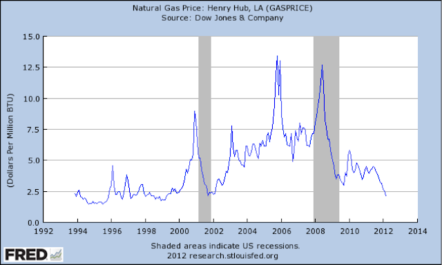
There aren't a lot of charts that look like natural gas. Over the last 5 years it's gone from one extreme to the other. It was caught up in the same energy bubble that oil was in 2008, but thanks to a true technological paradigm shift everything changed.


No comments:
Post a Comment
For compliance reasons, I don't post comments to the site, but I do like hearing from readers and am happy to answer any questions. Feel free to use the comment box to get in touch. Please leave an email address in your comment so that I can write back, or email me directly at Skrisiloff@avondaleam.com.